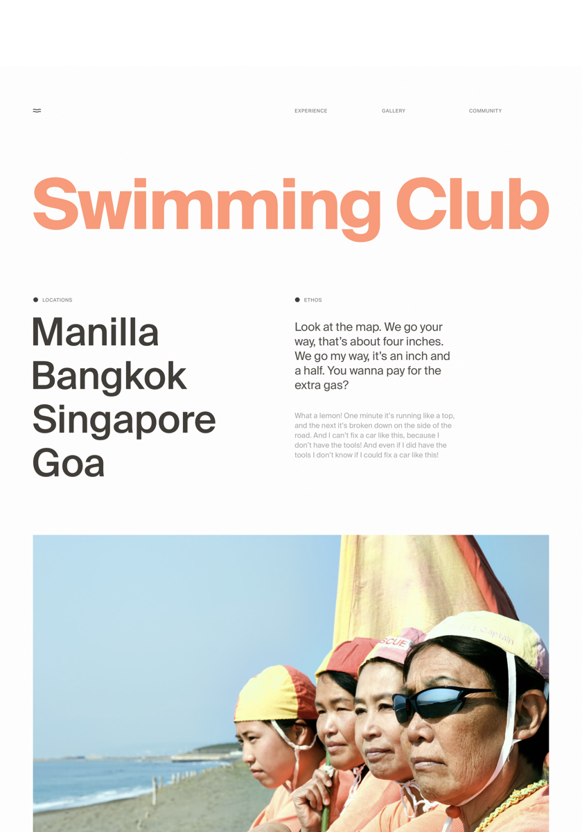
The “Less is More”
Design is a vast topic and one that is fundamental to everyone, no matter where they live or what they do. The best possible design of the tools we use can dramatically enhance our lives. From the gadgets in our kitchen to the simple handles on our doors the examples of good and bad designs are endless and all around us.
Of course, some of the most stimulating environments to witness the power of design today are the internet and print media. The concepts used for the design of both are similar and often intertwined. The evolution of magazine-type layouts onto the internet is a craft that relies heavily on good logical design principles. A page is often split into different columns and areas to separate a diverse array of information, so it is important not to have too much going on. Good designs flow logically from one linked node of data to the next. The ‘less is more’ adage has never been more true than in design today.
Good or Bad UI/UX?
Whether the UI/UX design of a website is good or bad can determine if a business will profit from traffic to its website or if it falls into obscurity. Visitors to the site must be able to instantly understand the content and be guided through it by appropriate user-friendly signposts. Presentation is a key element of a good design, but how is information to be presented? With the growing complexity of life and the bombardment of huge amounts of information at each individual, simplicity in design has never been more important.

The “White Space”
The space between elements on a page is known as white space. The importance of white space on a page cannot be underestimated. Having clear areas around text allows the eye to naturally scan the information presented without distraction. This concept can be extended to lesser elements such as items in lists or the space between words and even letters. Space increases the readability of an article, having a calming effect on the mind and encouraging concentration. A design format like this on a webpage would encourage a user to engage with the content, rather than clicking away from the page if they were not able to logically read it.

Colors and Typography
One or two graphic images on a page can convey more alone than crowded together on a page that is too busy. In the same way being presented with too much information can be confusing and irritating. The use of clear legible fonts and typography are desirable, as is a pleasant and harmonious colour scheme. Colors and typography can be used to draw the eye to an important area or to evoke a mood. The layout must allow the easy flow of information, without overpowering the reader all at once.

Conclusion
An essential aim of any successful design is for it to communicate on several levels with users. A website must function correctly and present information in a legible form. It must however, also be attractive enough to draw users to the content and make their user experience a pleasurable one. It is with this aim in mind that all elements of the design must work in unison.
